A dynamic brand for the world’s longest-standing lgbtq+ organization
Branding as a safe space
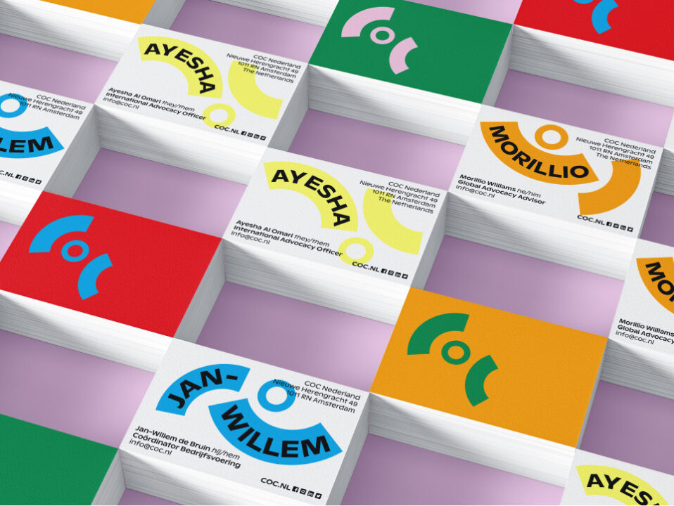
A diverse and inclusive society? COC has been working on it since 1946. The world’s longest-standing lgbtq+ organization needed a new brand identity and website to continue being a safe and trusted home for the lgbtq+ community. COC asked us to develop a brand identity that can grow with them – and the entire rainbow community – in the coming years. By experimenting with the concept of space – COC’s brand needs to give and take space – we have created a brand identity that can represent everyone, regardless of sexual orientation, gender identity, gender expression, and sex characteristics. The elements from the COC logo can occupy space (in public discourse) and create space (for the community); they dynamically move with the content. COC can incorporate this dynamic into every communication moment, both textually and visually. Now COC can take action, sound the alarm, celebrate successes, and connect people within one recognizable brand – while providing space for everyone within the lgbtq+ community.
- Strategy
- Branding
- Content
- Motion Graphics
- Development
- Copy
- Campaign


Resultaten
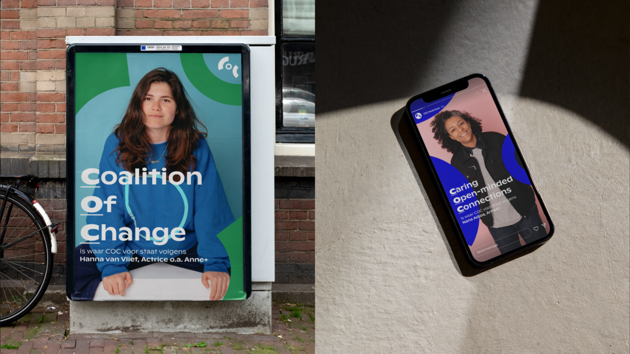
- Changing a logo that has been around since 1946? Tough call. That’s why we didn’t do that, but completely reinvented it. The logo gained its own character, becoming a dynamic tool that can evolve with COC.
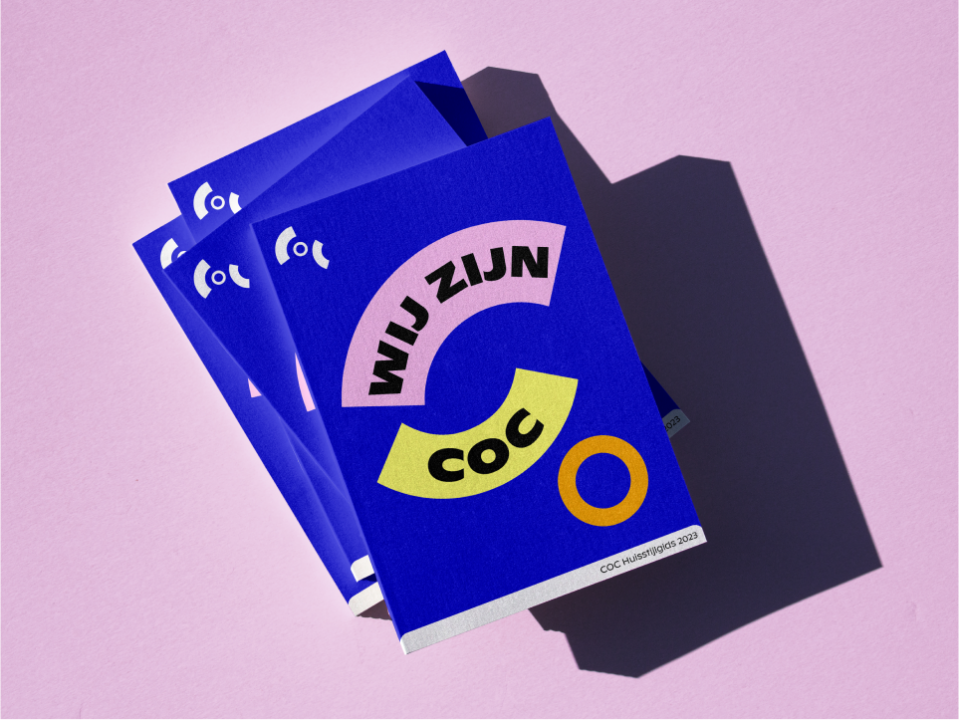
- The concept of giving and taking space extends beyond a mere design system; it empowers COC to infuse it into everything they undertake. With the creation of each new asset, they can consider whether they should take up space or give space. That’s how we’ve developed a sustainable brand structure where it’s not the designer, but the target audience and context that determine the design of communication materials.
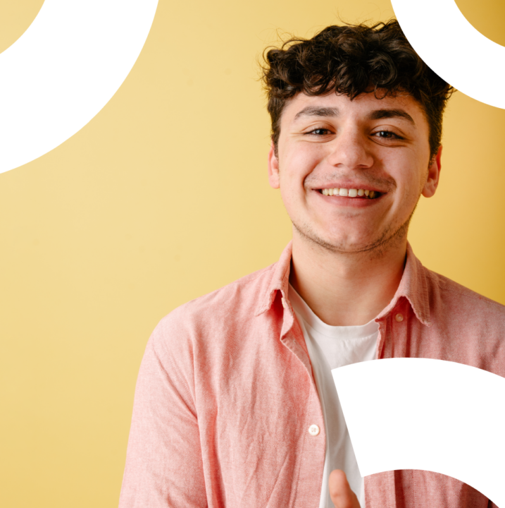
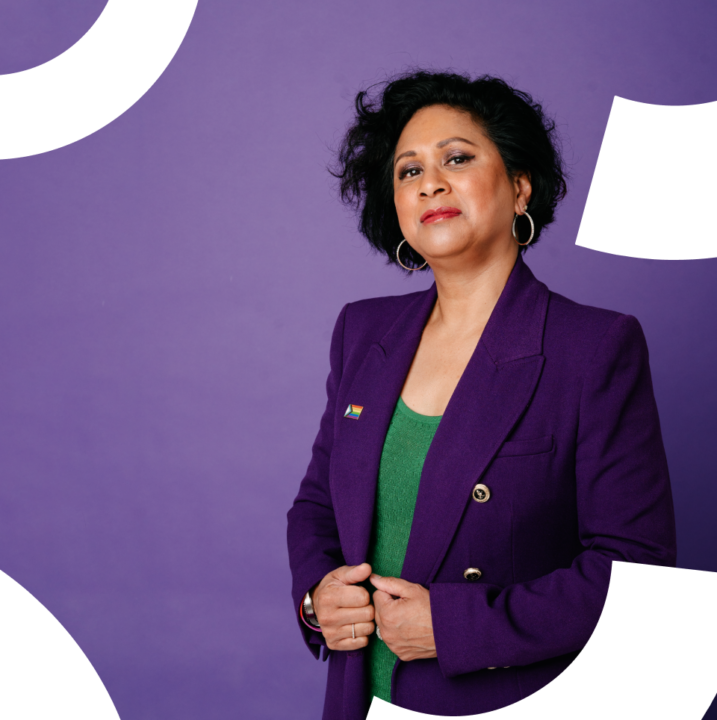
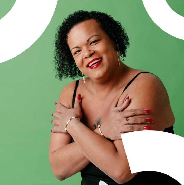
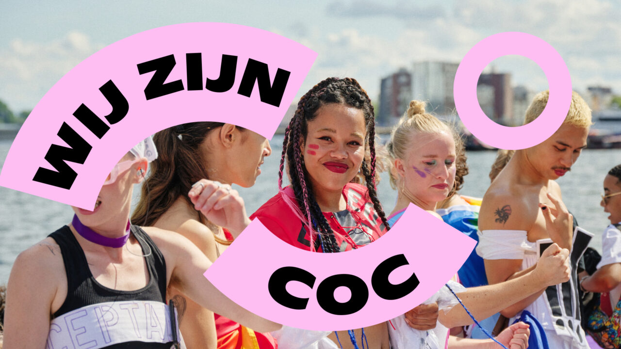
- Everything we created was crafted with meticulous attention to inclusivity. Font? Accessible and easy to read. Colors? Based on the Progress Flag. Copy? Open and respectful. We worked closely with COC to ensure that the end result seamlessly resonated with the target audience.
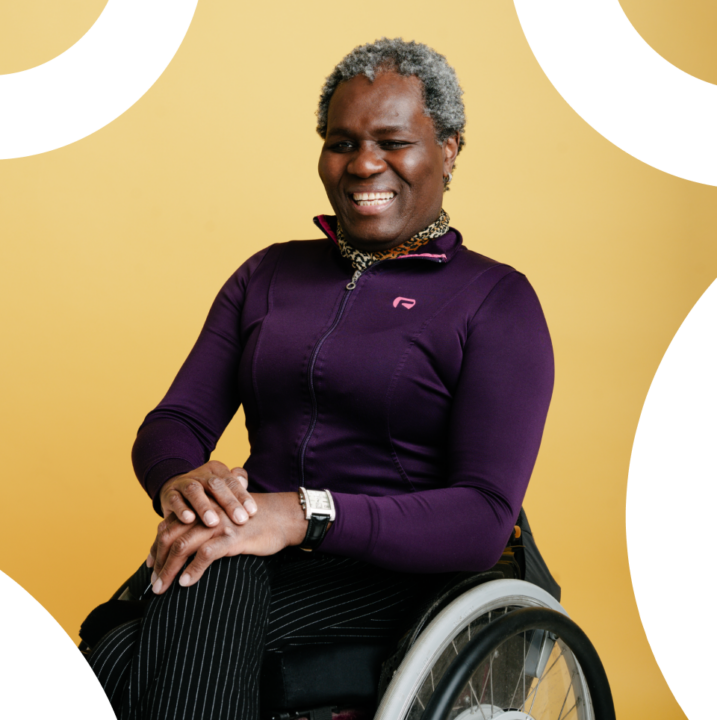
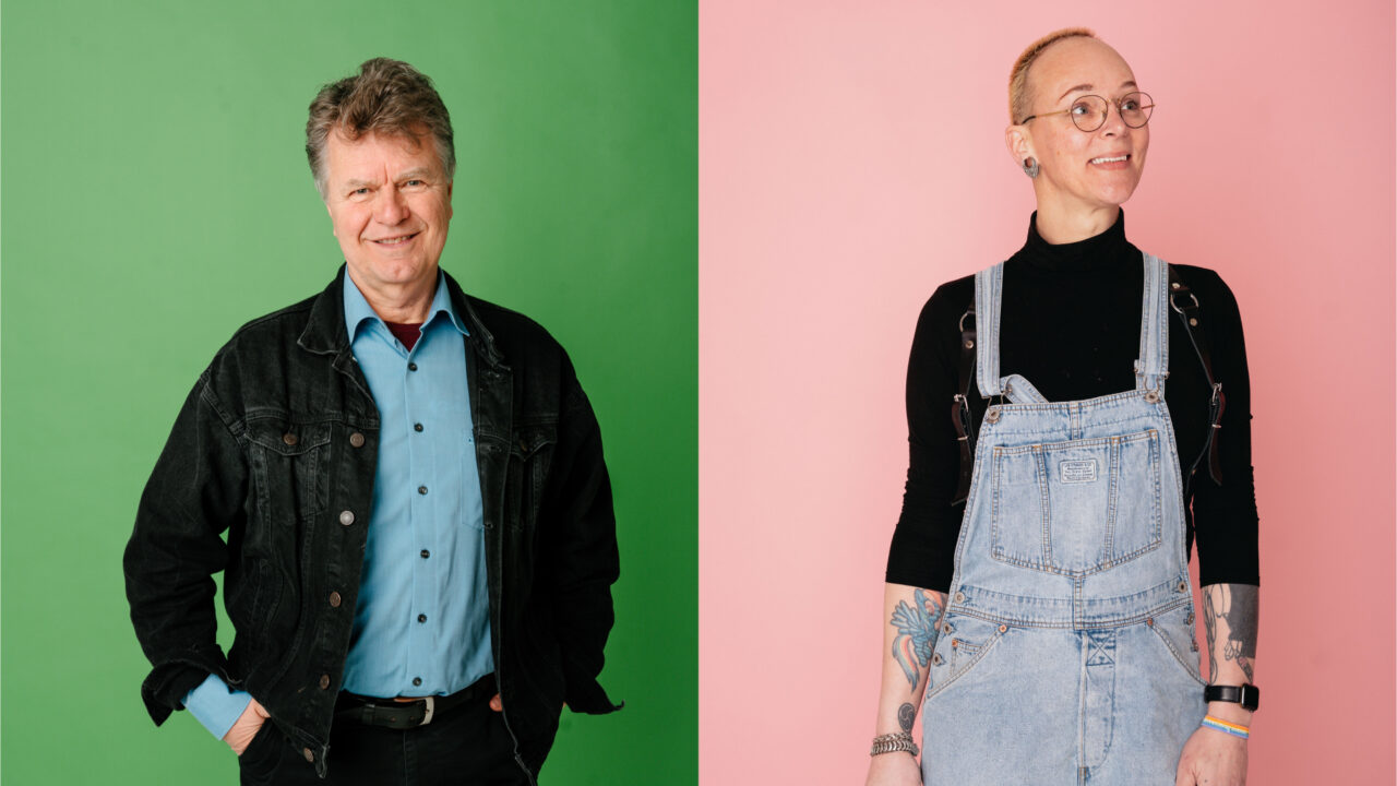
- For the launch campaign, we handed over control to twelve ambassadors: they were given the space to share their feelings about COC themselves.
Aanpak
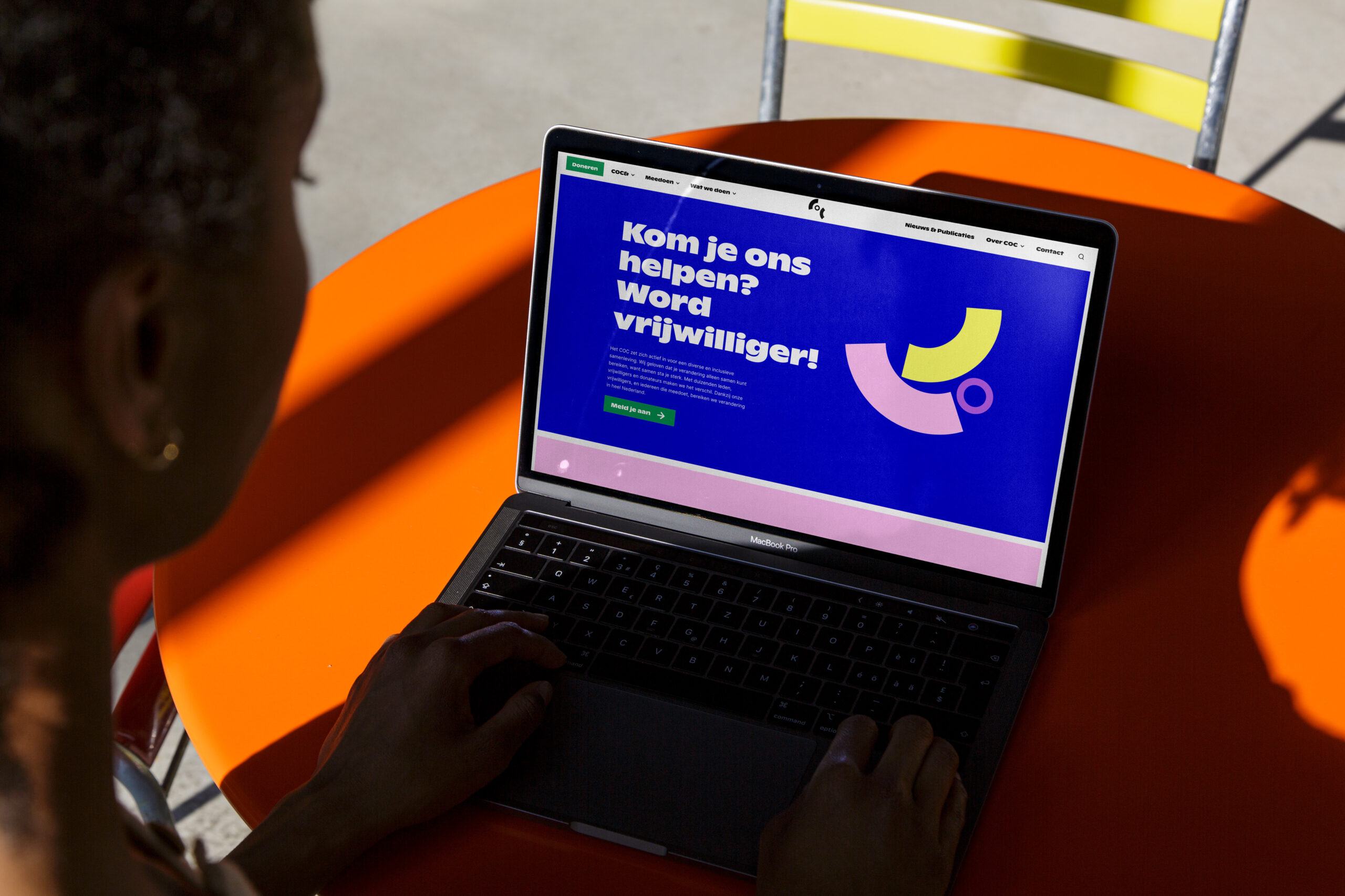
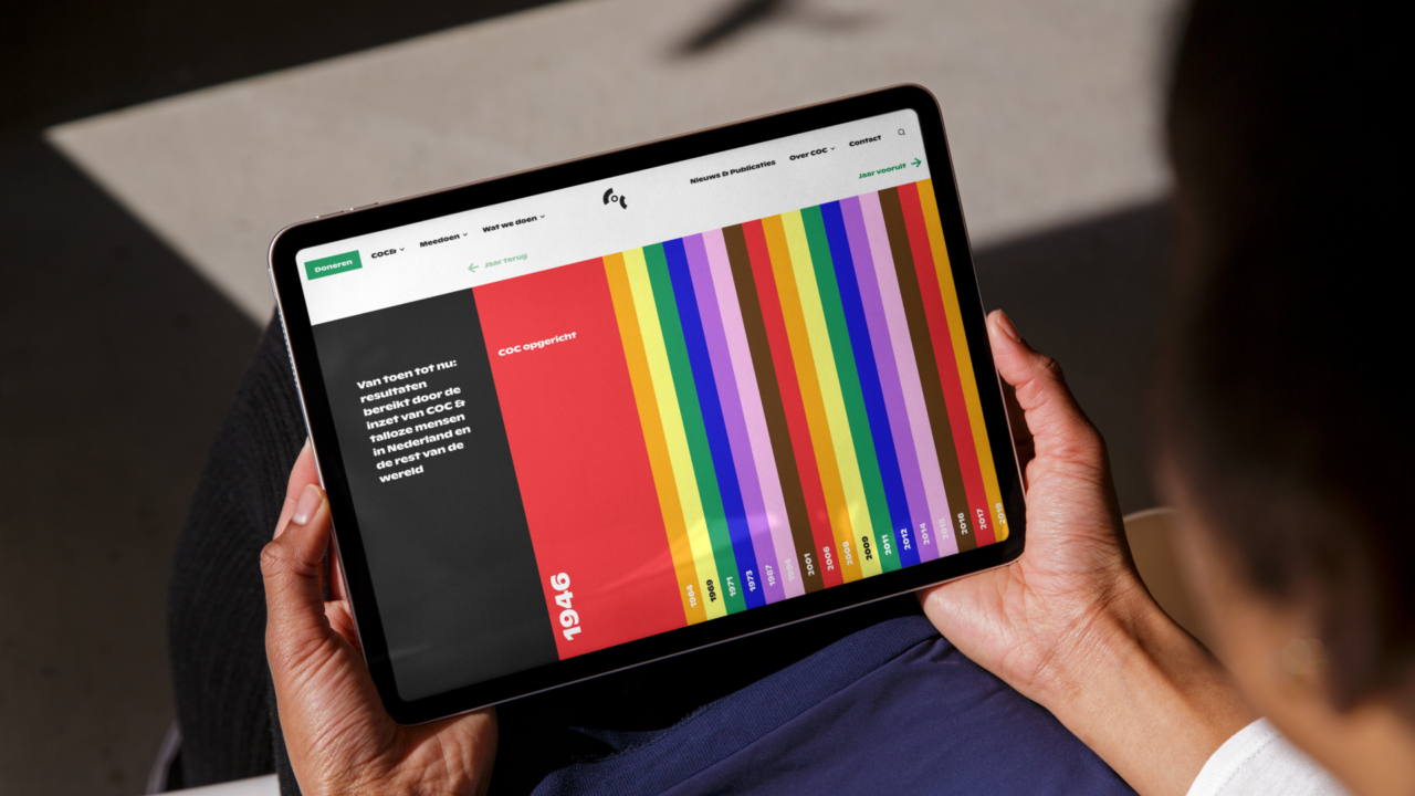
COC works on various themes, both nationally and internationally, and reaches a wide range of people. With a rich (and important!) history, COC possesses a wealth of knowledge, news and articles. Bringing all these elements together was a challenging task. Through intensive workshops and close collaboration, we developed a brand identity that builds upon COC’s core values. This identity was expanded into accessible digital resources, such as an advanced CMS system that makes all articles (around 6800) and knowledge accessible and searchable again. As a result, COC now has an extensive toolkit to increase visibility, both in society and for the lgbtq+ community.