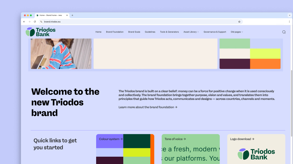
A brand built to behave like the bank
One bank, four countries, a shared future
Banking with Triodos sets something in motion. Because at Triodos, money funds clean energy, sustainable housing, or dignified care. And the people behind those projects? They bank with the same bank. That’s how Triodos works: everything is connected, everyone contributes, every euro counts.
The existing brand identity served Triodos well for years, but was built to convey trust. The next step: inviting people to be part of a shared movement.
Multitude developed the full brand identity for Triodos as creative lead agency, on a European level. From strategy to design, from bank card to annual report. The brief: a brand that makes the power of that system felt, across every channel, in every market.
- Strategie
- Branding
- Motion Design
- Digital design
- UX/UI
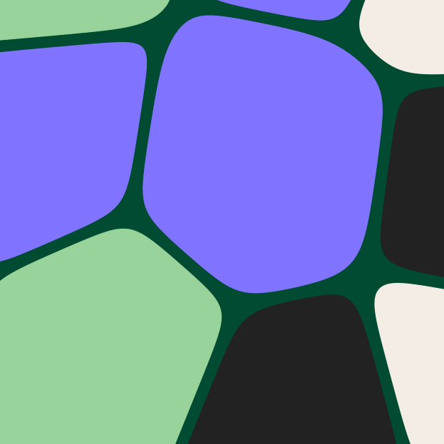
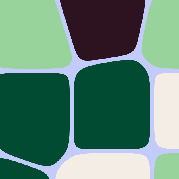
Designed as an ecosystem
Most rebrandings start with the brand and work outward. We started with the organisation. At Triodos, money flows from saver to entrepreneur, from entrepreneur to community, from community back to that same saver. Our starting point was that the brand identity should work the same way.
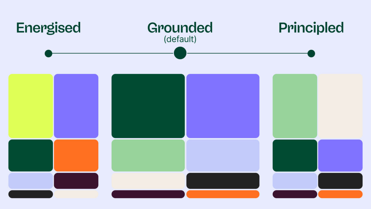
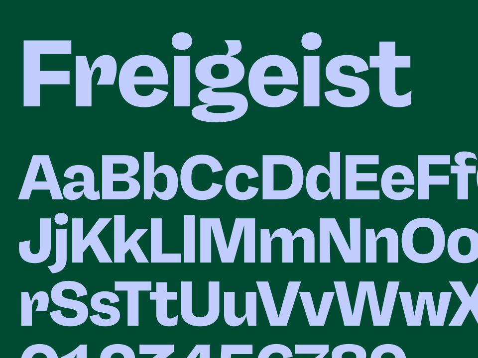
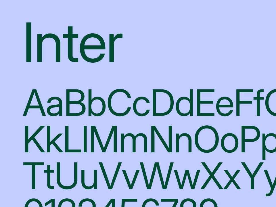
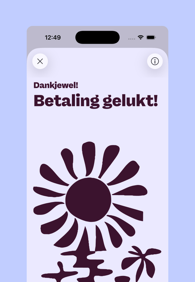
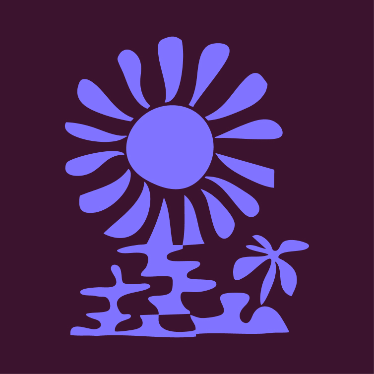
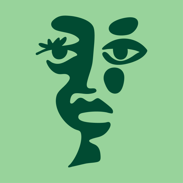
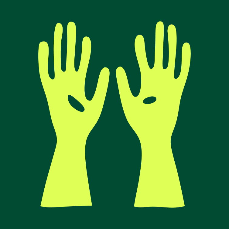
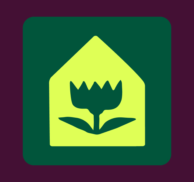
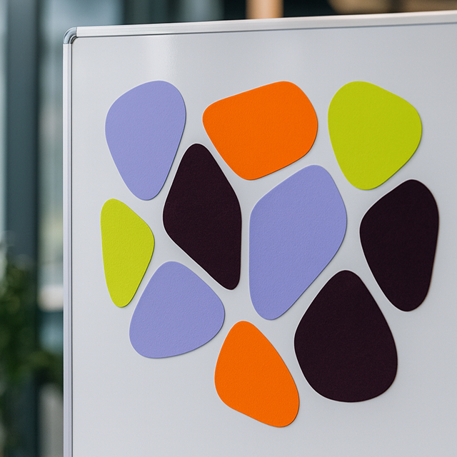
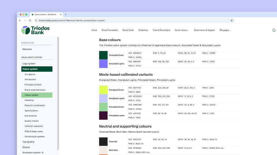
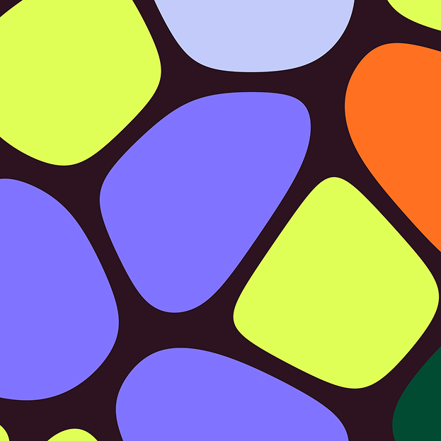
This led to a brand system built around three brand scales: Energised, Grounded and Principled. The full colour palette shifts accordingly. A youth campaign calls for different energy than an annual report, but it remains recognisably the same brand. The visual elements relate to each other the way participants within the Triodos system do: organically, in interaction, continuously forming new wholes. The typography is inspired by natural forms and the colour palette has been culturally researched per European market, so the brand feels locally rooted rather than imposed.
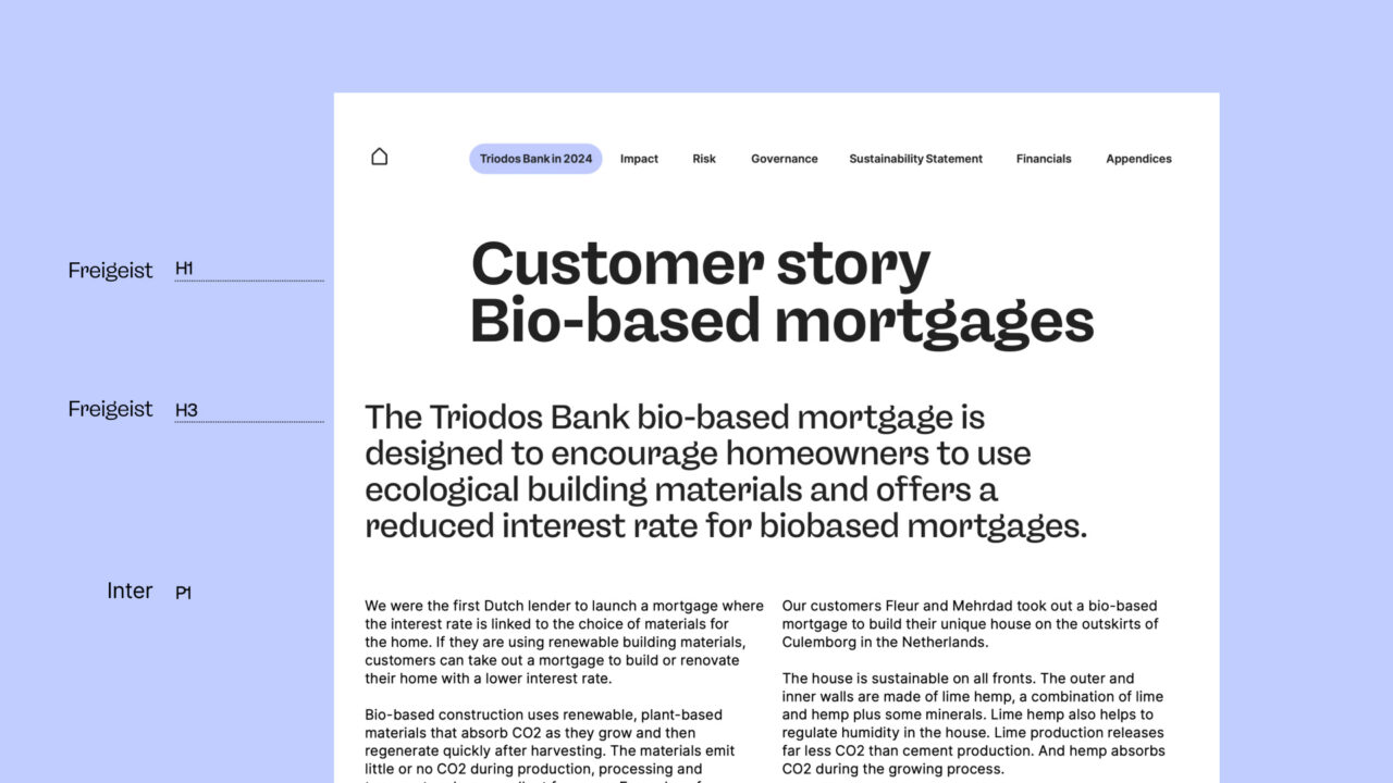
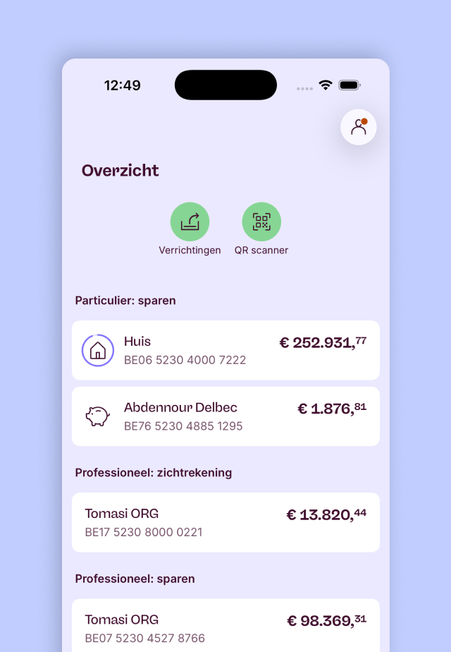
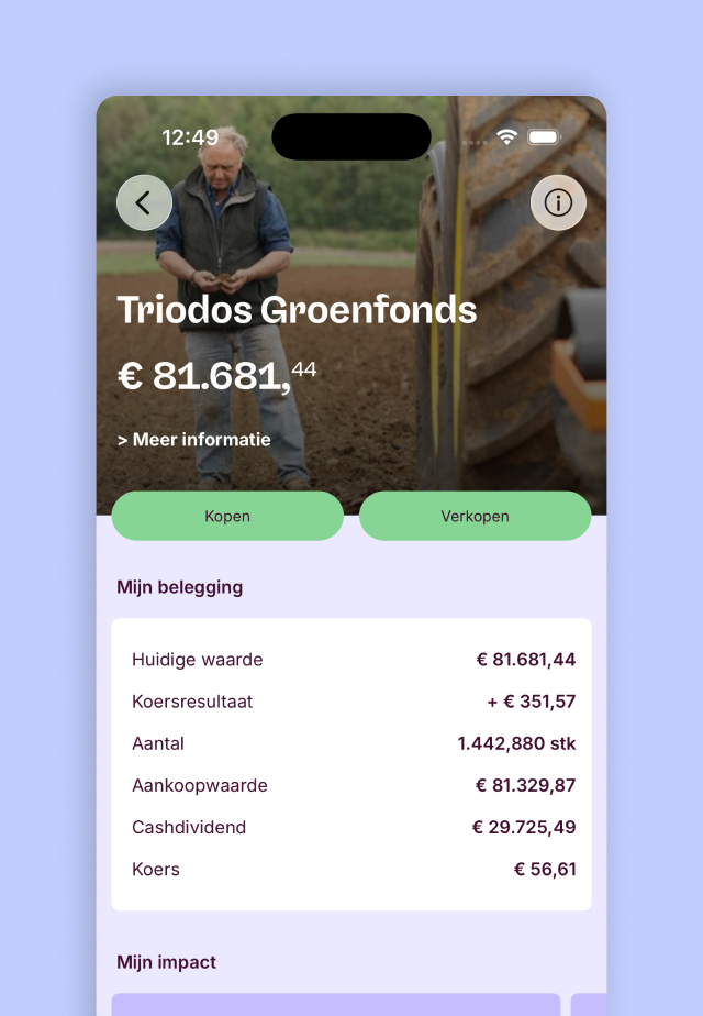
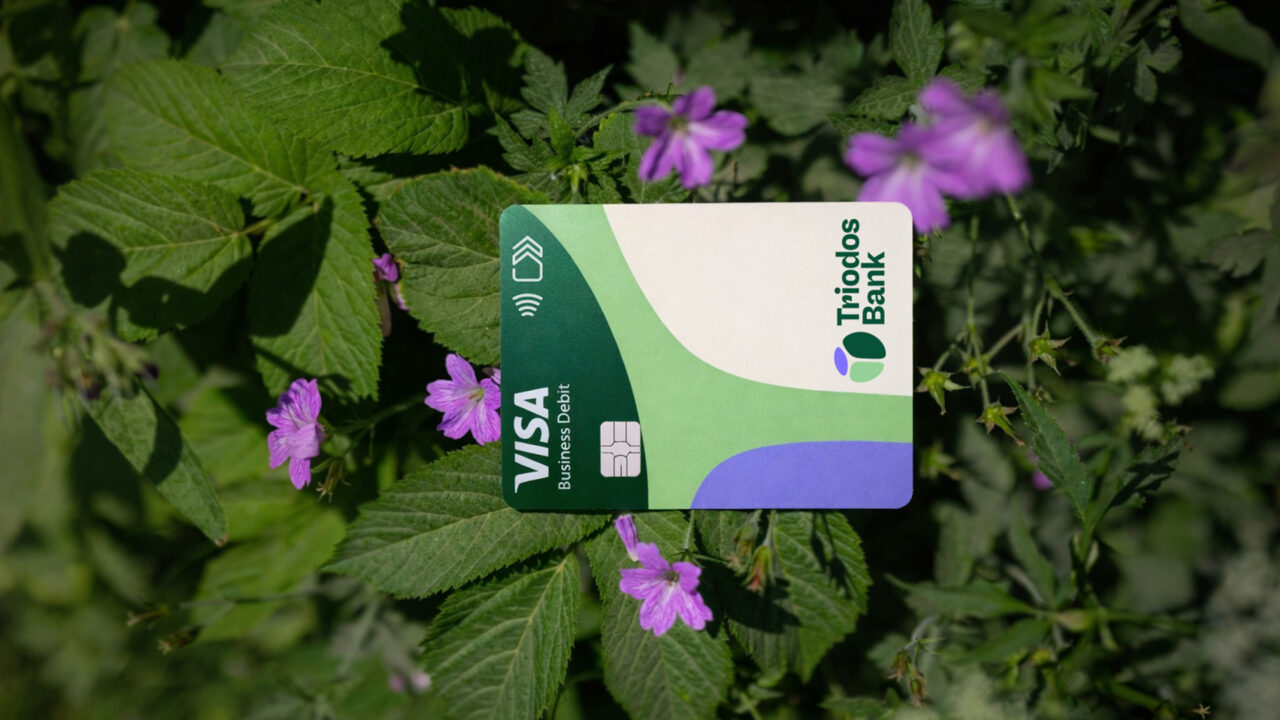
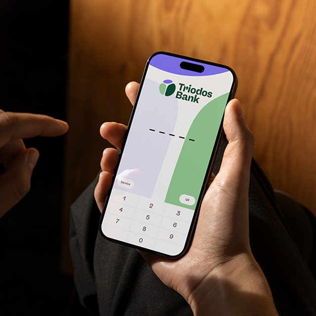
Everything has been translated across web, app, social media, annual reports, bank cards and stationery. One system, four countries, dozens of touchpoints.
A brand that does what the bank does
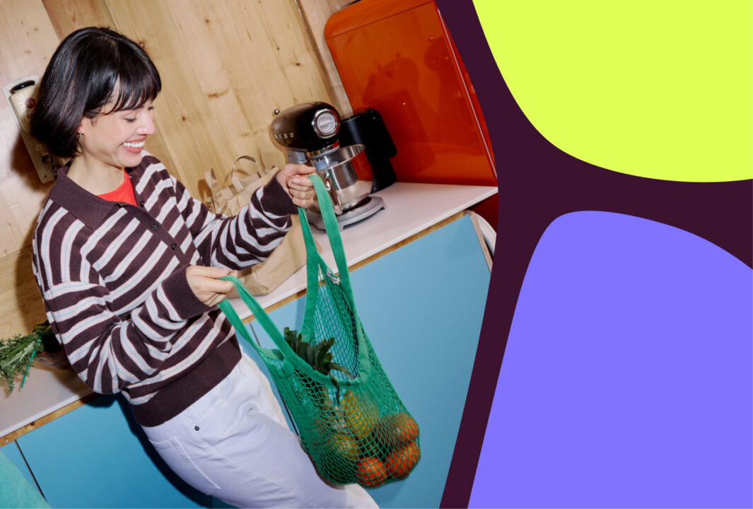
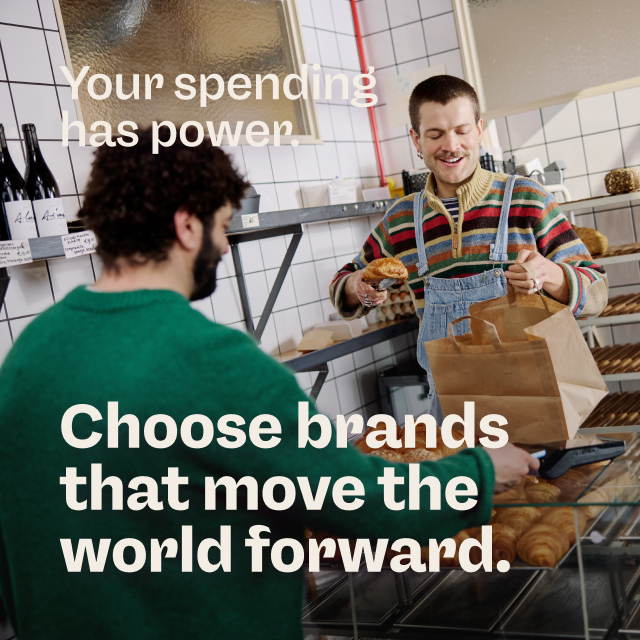
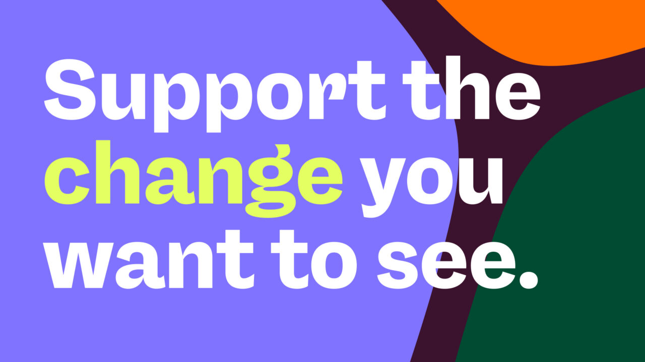
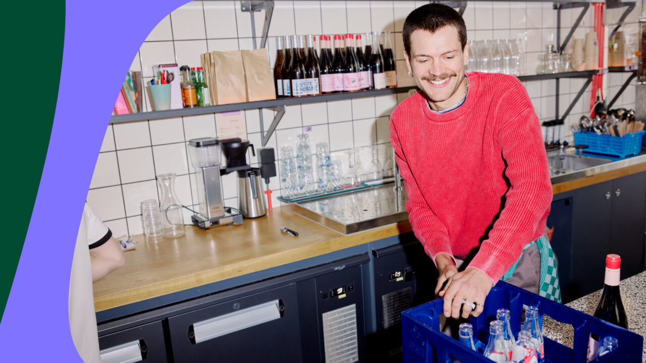
Most banks communicate from bank to customer, from sender to receiver. The new Triodos brand system works differently. The visual elements are relational: they only exist in interaction with each other, just as savers and entrepreneurs at Triodos are part of the same whole. The imagery shows real people in action, as participants in a shared movement, not as the target audience of a financial institution. And the logo comes to life in motion, reflecting a bank that is itself constantly in motion.
The more people join, the richer the system becomes. The visual language can move with new markets, new audiences, new forms of banking, without losing coherence.